Category: Visual identity, brand guidelines, web mockups
Client: Unyque, communication strategy & web integration
Company: NECA SA, Saint-Légier, canton of Vaud
Scope: Logo, brand guidelines, palette, typography, website mockups
The context
NECA SA is a French-Swiss company specializing in building services: heating, ventilation, air conditioning, plumbing, water treatment, and industrial piping. A serious operation, rooted in the canton of Vaud, serving private individuals, businesses, and industry alike.
When they brought us in, through our partner Unyque, NECA was starting a new chapter. New name, new structure, a need for a complete identity. Everything had to be built.
The challenge
NECA speaks to very different audiences. The homeowner who wants a heat pump installed doesn't have the same expectations as the technical director of an industrial plant looking for a piping partner. The identity had to be restrained and professional enough to lend credibility to the industrial offering, while staying approachable and warm for the private client.
The other particularity of this project: the client already had a rough logo in mind. An idea of a shape, a direction. Not an abstract brief, but a concrete vision to bring to life.
What we did
We started from the client's rough draft and made it real. There was no question of setting it aside and starting over. It was their vision, and it had to be respected and taken all the way. The work was about bringing it the graphic precision it lacked, refining the proportions, finding the balance between shapes, and making the logo work at every size and on every medium.
Around the logo, we built a complete set of brand guidelines: color palette, typography, usage rules. A coherent system that lets NECA communicate independently and professionally, whether on the web, in print, or on-site.
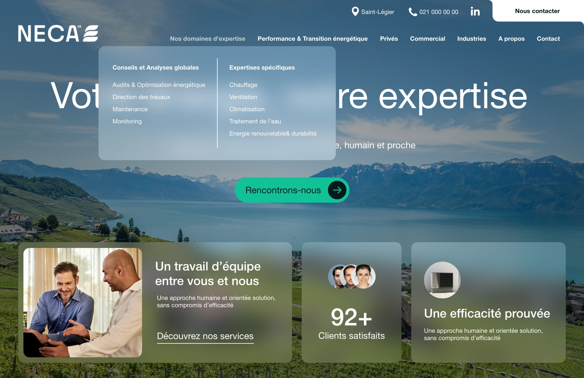
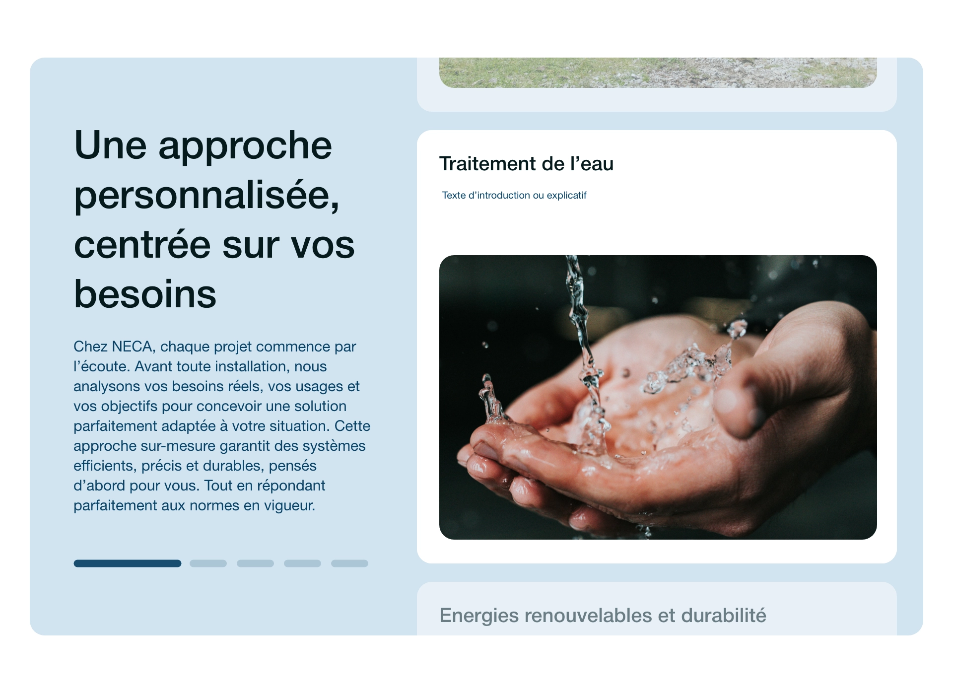
We then translated the whole identity into website mockups, keeping a clear navigation that lets each audience, private, commercial, or industrial, quickly find what concerns them.
The result
The site has been live since spring 2026. An identity built from scratch, consistent from the logo to the website, for a company starting out with the right tools to get noticed in a highly competitive sector.
What we take away from this project: proof that listening to the client's vision isn't a constraint. It's often the best starting point.
What this project taught us
A strong brand identity in the technical sector doesn't choose between seriousness and approachability. It finds the balance between the two, because its clients aren't all the same.