Category: Visual identity, packaging
Client: B&SWine, Bordeaux wine specialist, Switzerland
Scope: Label design, rolled out across the cider range
The context
B&SWine is a Swiss wine merchant specializing in Bordeaux wines. Maryline, its director, wanted to broaden the offering and reach a younger audience, between 30 and 40, with a new range called Apéro Vibes. A light, summery, approachable range that moves away from the classic codes of wine toward something more spontaneous. Rosé first, then Breton cider.
Nothing existed yet. No product, no identity, no reference point. We were starting from scratch.
The art direction
Before touching any software, we asked one simple question: what should this range make people feel?
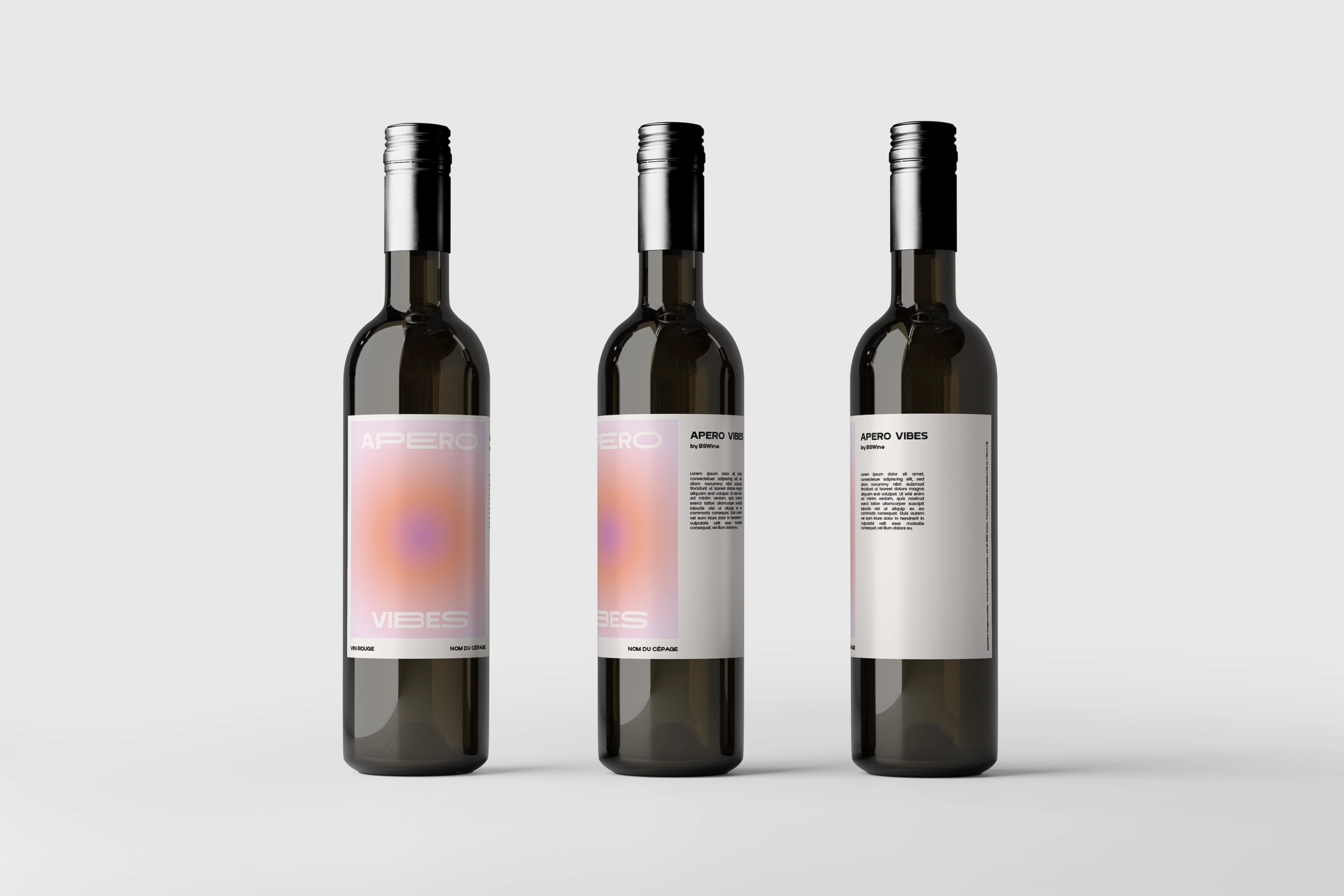
For the rosé, the answer was immediate. That early-summer-evening feeling, sitting on a terrace, facing a sunset, in that warm, enveloping light. The lightness, the carefreeness that summer brings without warning. A holiday without quite being one.
The colors grew out of that. Warm, luminous gradients that shift the way light changes at the end of the day. No cold typography, no classic wine-industry codes. A label you want to set on the table and look at as much as drink.
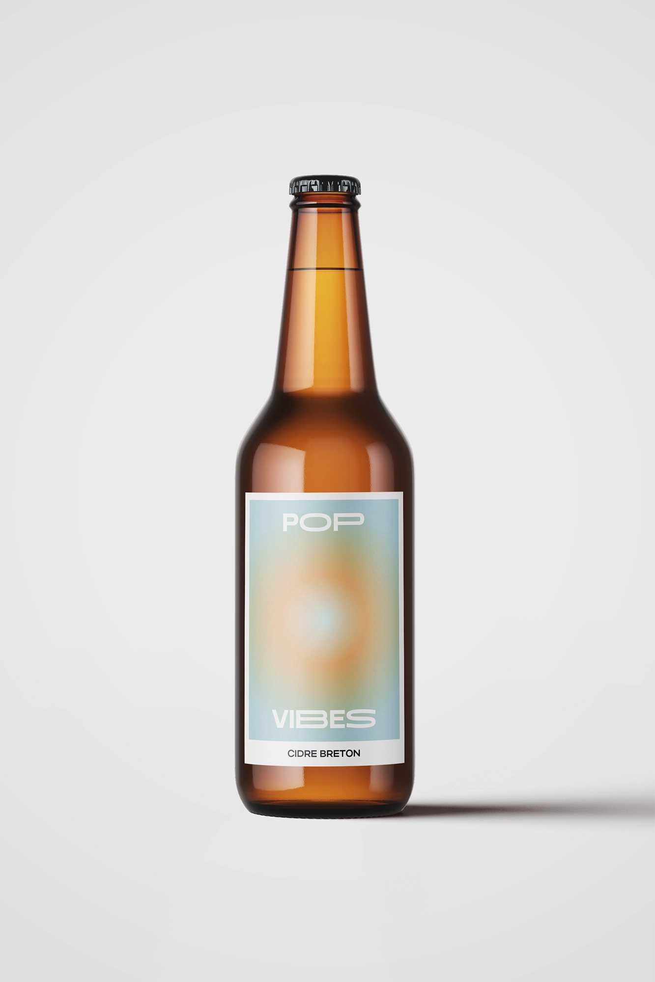
For the Breton cider, the register changes. Water, the sea, the freshness of the Atlantic. The tones shift toward blues and greens, still in gradients, but with a different energy, sharper, more mineral.
What we did
We started with the rosé label, the centerpiece of the range. Once the art direction was approved, we rolled out the same visual language across the cider labels, adapting the palette to the Breton world without losing the range's consistency.
The result: two distinct products that are immediately recognizable as part of the same family. A visual identity built on emotion, not on the conventions of the sector.
The result
There was no "before." Apéro Vibes didn't exist. Today the range exists, it has an identity, it's on the shelf.
Maryline now has a solid visual foundation to keep growing the range, add new products, and in time build a digital world of its own for Apéro Vibes.
What this project taught us
Good packaging doesn't describe a product. It transports you. The brief wasn't "make a nice rosé label," it was "make people feel summer." The difference between the two is all the art-direction work that comes before the design.